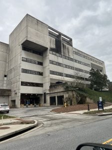
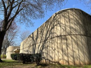
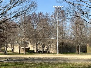
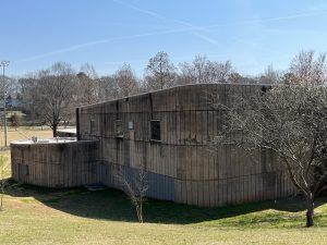
Brutalist Architecture in DeKalb County
Brutalist architecture in DeKalb County. Learn the definition, the characteristics, and examples in DeKalb County.
Updated 5/2023
By Melissa Carlson, Executive Director
Brutalist architecture, or Brutalism, is a style a lot of people love to hate. (1) Portrayed as a reactionary style to the modernist architectural movement, it was popular from the mid-1950s through the 1980s. It is said that the name originates from the French phrase, béton brut, which means raw concrete. (2) But Brutalism is so much more than that. Since its beginning, this global style has used materials local to the construction area, including concrete, brick, stone, glass, and metal. Concrete had not previously been showcased by modern architects; it had never been used so prominently on the interiors and exteriors of buildings. Part of the early concept of this style was to highlight the functional and structural building parts with “honest” materials that were no longer hidden from view.
The style is hard to define, especially when the exterior is not concrete. It is tricky, in part, because Brutalism is so associated with concrete, and that origin story may not be true. Despite this association, the first two buildings defined as Brutalist are in Europe and were brick, and brick with metal and a great deal of glass. So, Brutalist buildings are not only made of concrete, and not all concrete buildings are Brutalist. Additionally, the style was unclear from the start – in the late 1950s architects disagreed on what elements made a building Brutalist. “Architect John Voelcker explained that the ‘New Brutalism’ in architecture ‘cannot be understood through stylistic analysis, although some day a comprehensible style might emerge.’” (3)
High Style Georgia Examples
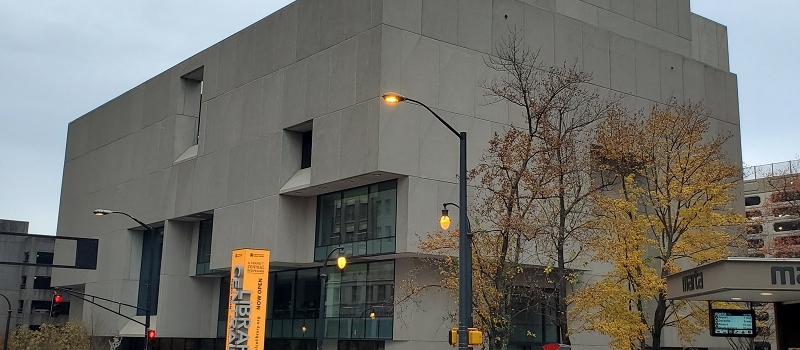
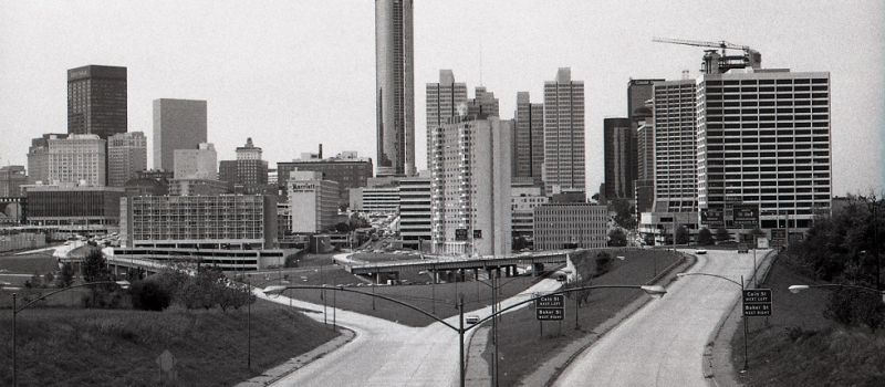
I think the two examples listed on the National Register in Georgia only highlight the difficulty in defining this style. They are the Atlanta Central Library (Marcel Breuer) and the Peachtree Center Historic District (John Portman). (4) (5) These are two very different examples of Brutalist architecture. Breuer’s six-story library (begun in 1977) is a single sculptural building with few windows. Peachtree Center (1966 – 1988) is a 14-block district of related office towers, hotels and more, and therefore the structures have many windows. The National Register nomination for Peachtree Center describes it as a “refined permutation” of Brutalism. This style seems to have two or more unnamed subtypes. In DeKalb County, we have only identified a few “high style” examples of Brutalist architecture; plus, there are a number of structures that seem best defined by this style. (6)
Criticism
This style has been criticized over the years as inhumane and unwelcoming. Other descriptive terms found in conjunction with Brutalism include: monumental, severe, imposing, dramatic, exposed, unfinished, honest, ugly, assertive, cold, monolithic, heavy, brooding, vulnerable, ominous, confrontational, and bulky. I do not know of any other style that has a comparable list of emotionally evocative characteristics. It makes for an odd list of “major characteristics” to help the layperson – or expert – identify this style in the field. But some say it’s easy to recognize because they don’t like it. The style is so foreboding an Instagram account exists to “juxtaposes brutalist buildings with super-scaled cats as a means of introducing warmth, softness, and whimsy to the often-perceived-as cold, hard, and severe forms of brutalism.”

Popularity
What explains its prevalence? When it emerged, Brutalism was very modern, and therefore showed that the owner was forward thinking. Plus, poured-in-place concrete buildings were inexpensive to build. These two factors helped popularize the utilitarian style with local, state, and federal governments as well as college administrations. Emory University is home to some of the best examples in DeKalb County (Georgia Tech has many as well, including Brutalist structures made entirely of brick). In Georgia, it was important – for a while – to show that we were keeping up with the rest of the world by showcasing various styles of modern architecture. But southerners never lost the desire for more traditional buildings based on colonial or classical styles, so Brutalism is less common here than other regions of the country.
Characteristics
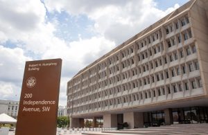
Brutalist buildings are usually massive, monolithic (having one predominant masonry material), and blocky – although curvilinear examples abound. They may also feature angular geometric shapes. They often showcase large-scale use of poured or cast concrete, but may also feature brick, stone, glass, and metal. They are usually monochromatic with the concrete left bare and unfinished, but in the current time, this older concrete may be painted to “beautify” or maintain structures as the concrete begins to stain or is subject to graffiti. Windows fall into two very different categories – on some buildings they are quite small, sparse, and deeply recessed; on others, generally office buildings, they may cover the building with what one commentator referred to as “aggressive” fenestration. Often described as top-heavy, many of the bulky buildings “float” on piers, columns, or inset bases.
Brutalist buildings are generally devoid of ornamentation. Concrete, when featured, may have been mechanically textured (hammered or chipped), it may be smooth or corrugated, it could have a pebble finish or other exposed aggregate, or it may have the impression of the wood form. Other characteristics may include: a combination of projecting and recessing building parts and strong horizontal elements. However, some include vertical elements – especially windows that may be described as vertical slots. The windows usually do not open and are either set deep into the walls, or are framed with projecting vertical slabs, which give the façade depth and create shadows. Some buildings will have exposed concrete waffle slabs for ceilings. Repetition of forms, such as windows or panels of concrete, also helps to define this style.
The style started out as one that was – if not well-defined – at least recognizable to many since the buildings contrasted sharply with most architecture up to that point. Often at the end of an architectural style’s era, you’ll find buildings that have just a few elements that reference it. Like most styles, it was begun by notable architects, but over time became more commonplace and it was eventually used by builders and clients in urban centers across the nation. This results in a more vernacular building, with only a few of the characteristics remaining. (7) The Brutalist vocabulary shows up in the widespread use of concrete blocks cast in molds which produced a ribbed, or corrugated, chipped concrete surface. The style has even made a resurgence as of late in some homes, but these later versions will likely be referred to as Neo-brutalist in decades to come. And they seem to provoke as much criticism as their historical antecedents. Many Americans still do not want to live nor work in a concrete building.
A chronological sampling of Brutalist Architecture in DeKalb County
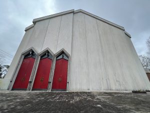
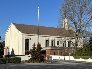
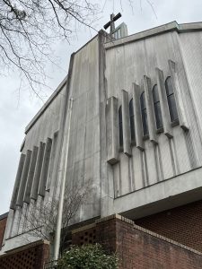
Holy Trinity Parish Episcopal Church, 515 E. Ponce de Leon Avenue (1968)
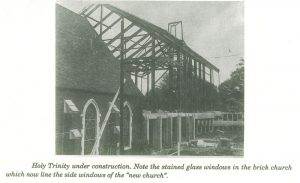
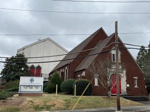
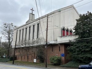
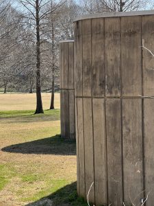
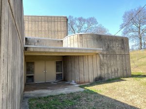
This very modern church was the third structure on this site for Holy Trinity’s Congregation. The church was established in 1892 on the corner of Church Street and Trinity Place but purchased this site in 1928 for a new church. However, the small brick church seen in these photos was built in 1951. After WWII, the congregation experienced exponential growth (reflecting DeKalb’s expansion in the 1950s) and needed an even larger building, which was completed in 1958. In July of 1967, a fire gutted portions of the church complex and seriously damaged the church. In considering all options, the Reverend Hopper stated “…we do not want to be extravagant, but we do want to have a parish of which we will not be ashamed and that will aid us in doing an effective piece of work to further the Kingdom of God. Therefore we need a building that is functional, attractive and distinctive without frills, a force in our community and diocese.” It was designed by architect Louis H. Swayze and the groundbreaking was in December 1968. This Brutalist church was dedicated in October 1971.
Although modern in style, the 1968 sanctuary still echoes the gothic forms so loved by Episcopal congregations – inside and out. The exterior is formed by full-length corrugated cast concrete panels that are all the same width. The front is “broken” into four depths with setbacks, but is otherwise only punctuated by a trio of sharply pointed red doors with transoms. The sides and rear have narrow stained glass windows with small concrete louvers and hoods to help protect them. The entire mass of concrete sits atop a slightly smaller red brick two-story base which has narrow “arrow slit” windows.
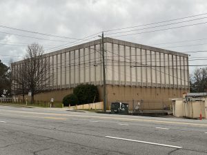
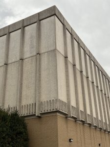
Southern Bell Telephone & Telegraph Co., 2204 LaVista Road NE (ca. 1970)
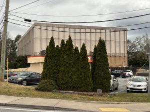
Now AT&T, this structure goes almost unnoticed on its perch above Dunkin’ Donuts – but drive by it enough times and you’ll realize this eerie building has no windows at all on its main facades. It is DeKalb’s version of New York’s telephone exchange building – but of course, it’s not a towering skyscraper.
This seemingly three-story building consists of a pebble-finished concrete block, atop a beige brick base. There is a solid horizontal band at the top and another one composed of vertical raised bars at the bottom. Larger vertical lines form a rhythm across all of the concrete, and frame the joints where the modular panels meet. The sign on LaVista is original to and matches the building.
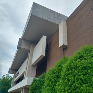
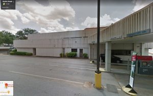
Former JCPenney, South DeKalb Mall, 2845 Candler Rd (1970)
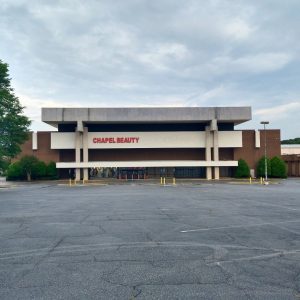
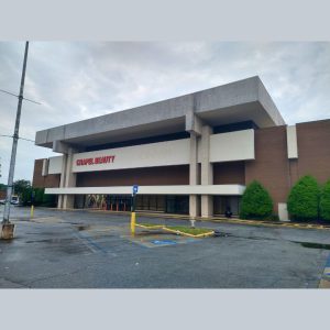
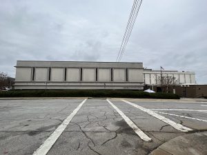
It should be no surprise that an anchor mall unit is on the list of Brutalist structures in DeKalb County. Malls and anchor units are inherently Brutalist by nature. Malls are designed to be devoid of windows and shielded from the outside world, their hulking boxes lend themselves to brutalism. South DeKalb Mall was one of a growing new trend for Atlanta Metro area malls: fully enclosed and built in a growing suburban area. The look and feel of this former JCPenney was designed with all that in mind, and included brutalist and unique characteristics. While this building is only two stories, the roof adds height and gravitas.
As with most malls, South DeKalb Mall was developed and financed by securing anchor tenants. These anchor tenants, like JCPenney and – on the other end of the mall – Rich’s, would develop their own exterior design for the stores. This building fits within the style of the rest of the mall designed by Stevens and Wilkinson but is different enough to be a visual anchor easily found from a car.
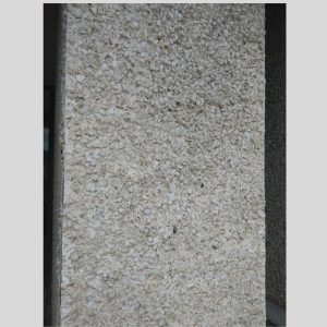
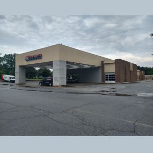
The slab roof is a hulking floating mass, although it is deceptive. The floating section is just a thin panel while the black void underneath is actually a wall hiding utilities. The weighty roof also resembles New Formalist designs that were built at the same time. Post and beam-inspired concrete columns support the slab and allow a canopy overhang. The posts and beams add “honesty” to the structure, letting you see how the roof is supported. The white beams also protrude from the side of the building and the adjacent car center to continue the brutalist theme. But on the sides, those “beams” contain downlights which actually change that design element into a cascading column of light. Exposed coarse quartz aggregate concrete was used on the roof and columns and only later were portions of the concrete painted off-white. One can only imagine how the quartz facade must have originally glimmered in the sun.
We know Stevens and Wilkison designed South DeKalb Mall, however this anchor unit was designed by Law Kingdon Architecture (today LK Architecture) out of Wichita, Kansas. The facade is nearly identical to the JCPenney in Franklin Park Mall, Toledo, Ohio (1971).
Many thanks to Hassan Jabbra (ret.) of LK Architecture who has been with the firm since 1969 and quickly identified this building.
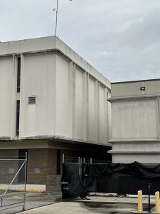
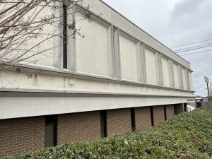
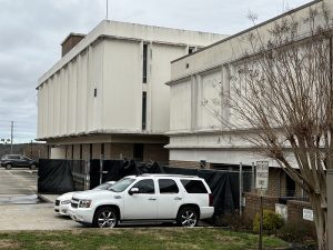
Robert T. “Bobby” Burgess Building, DeKalb County Police Department, 3610 Camp Drive (1972)
The massive “Camp Circle Courthouse Complex” was built by DeKalb County in 1972 and included the jail, Magistrates and Traffic Courts, and a brand-new Aviation Unit. The Unit had just received its first helicopter and the complex was built with a helipad on its roof. It was later named in honor of Burgess who was the longest running Chief of Police for DeKalb County.
There are two structures of different heights; both have enormous concrete tops atop smaller brown brick bases. The concrete portions have continuous horizontal ledges above and below narrow windows framed by vertical concrete louvers. There are windows in the brick portion, which align with those above, but are slightly larger. The whole effect is of an imposing and perhaps impenetrable fortress – one might expect arrows to be shot out of the narrow windows at any moment. It is located at a prominent point overlooking Memorial Drive and I-285. Yet it stands in the shadow of DeKalb’s newer jail, which could be considered Neo-brutalist.
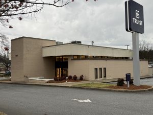
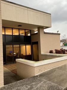
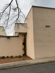
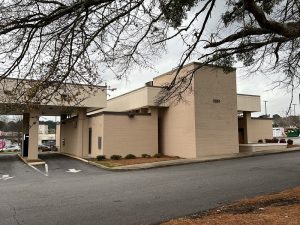
First National Bank of Atlanta, 2849 N. Druid Hills Road NE (ca. 1973)
Now a Truist Bank, I nearly missed this building until I was in its parking lot. It is a good example of a one-story Brutalist structure that also looks like it could have been built today. As DeKalb quickly grew during the 1950s, banks branches were added at a rapid rate. Traditional styles were still used, but some of the branches exhibited daring modern design.
This concrete and brick building has low horizontal lines interrupted by a few vertical accents. It is a great example of what is meant by a combination of projecting and recessed building parts, with its sunken entrance adding to that design. While many of the windows are not recessed, the clerestory band of windows underneath the concrete are stepped back and separated by projecting vertical brick walls.
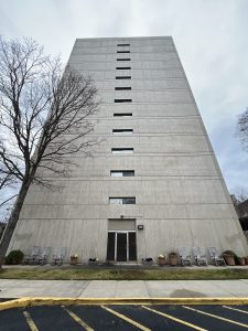
Clairemont Oaks, 441 Clairemont Avenue (1973-1975)
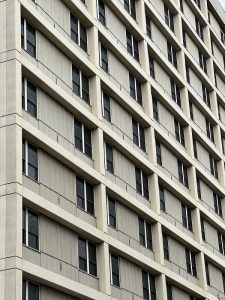
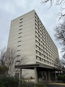
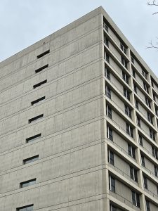
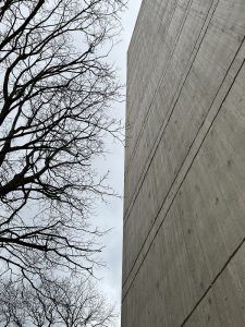
Driving down Clairmont Avenue, one could almost miss this stark 14-story residential building. The “side” of the structure is what faces the street – a nearly unrelieved slab of board-formed concrete. The tower could be considered an example of how Brutalism has “nothing to hide.” When you look at the long sides of the building, there is just one exterior “module” that repeats across 12 rows and 12 columns; the resulting grid shows the floors and apartment walls. Of all our examples, I think this structure would be most at home in the Eastern Bloc. Clairmont Oaks was built as a retirement home by the First Baptist Church of Decatur and advertised 298 units – it appears these were all compact one-bedroom apartments.
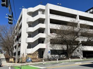
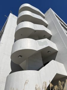
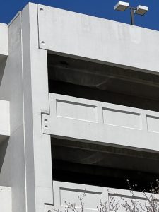
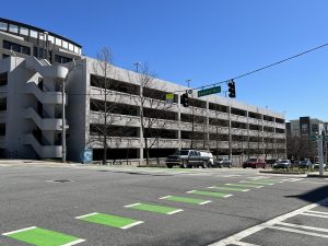
DeKalb County Parking Deck, 125 W. Trinity Place (1974)
There are several high style European examples of Brutalist “car parks,” although some are being demolished. It makes sense as most of these structures were built when parking became an issue for urban areas from the late 1950s into the present. While ours is not particularly flashy, it was built entirely of concrete by a local government and features four massive and sculptural staircases on the corners.
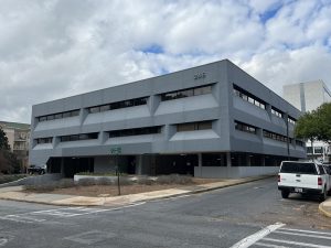
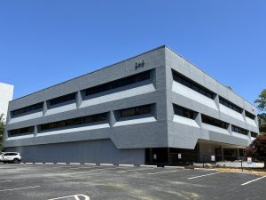
Brevard Professional Building, 246 Sycamore Street (1972)
This surprising office building is located in downtown Decatur. Its exterior is exclusively concrete and glass, with its two-story block hovering over parking. It has horizontal bands of deeply recessed windows, which are rhythmically separated by concrete wedges. The exterior was painted white. The interior features a 3 story skylight in the lobby. The 1.4 million dollar building was designed by Architect David Van Fraser, AIA and constructed by MacConochie Construction, INC. Van Fraser was known to design minimalist buildings, and would fit unobtrusively in their surroundings. Soon after this building, he became head architect with Norfolk Southern. The building is named after his daughter Anne Brevard.
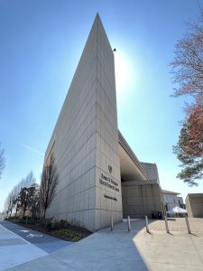
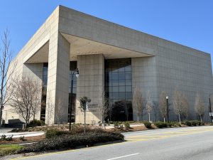
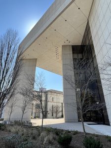
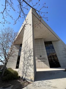
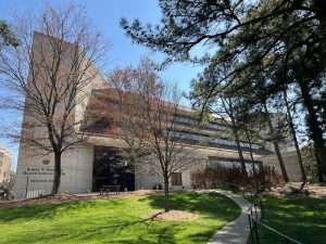
Woodruff Health Sciences Center Administrative Building (WHSCAB) at Emory University, 1440 Clifton Road (1976)
When I was a student at Emory, this building truly fascinated me and my friends. We marveled over this modern “pointy” building at the edge of a campus full of more traditional looking structures; it was just so arresting at the pedestrian level.
The innovative architect, Merrill Elam, was 32 years old. She worked at Heery & Heery Architects & Engineers and subsequently formed two firms which bore her name (the current firm is Mack Scogin and Merrill Elam Architects, which has had numerous notable commissions and awards).
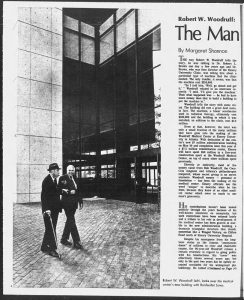
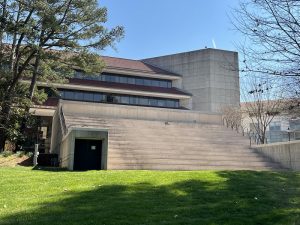
According to Elam, the building combined the needs of the students with the “need” to make a strong monumental statement to Robert W. Woodruff, who was a major contributor to the entire Woodruff Medical Center at Emory University. The triangular shape allowed students to cut through the lobby level exhibition center. Administrative offices are in the two upper stories. There is a “partially submerged education theater” which looks like giant stairs to nowhere from the outside.
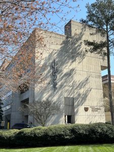
The triangular shape of the building means you get very different perspectives as you travel by it. The building primarily presents as an angular mass of large cement panels. The 90-degree angled corner on Clifton Road has a tremendous porch supported by a single acute triangular column. If you are unfamiliar with the building, it might be difficult to guess what’s inside or how many stories there are. Behind the column, two rows of windows, which stretch from the floor to the roof, are the only interruption to the concrete. The back of the building – facing Eagle Row – is an entirely different story. From here you can see the administrative floors which are topped with red tiles roofs, a nod to the rest of the campus architecture and a strange departure from the usual Brutalist vocabulary. An addition was made to the Education building to the south of WHSCAB in the early 2000s that impinges on the views of the façade from Clifton Road.
Emory Rehabilitation Hospital, 1441 Clifton Road (1976)
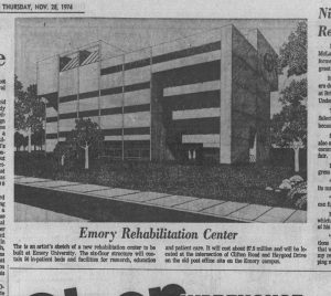
While WHSCAB caught my eye as a student, I only recently noticed the Emory Rehabilitation Hospital. It, WHSCAB, and 2 other building projects were part of a five-year construction spurt financed in part through donations from Robert W. Woodruff.
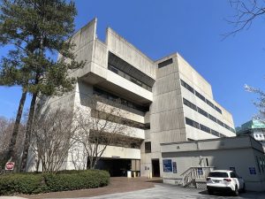
On the left side of the façade, but facing Haygood Drive, three of the floors are stepped back in a descending pattern which opens to accommodate a covered patient drop-off area. This is switched on the opposite side, where the top floor projects out past the main block of the building. The short edge of the building faces Clifton and is a large mass of board formed concrete with the projection at the top. A single angled opening on this side provides ventilation into the covered drive. Overall the building uses the Brutalist vocabulary of angles, set-backs, and voids, but the windows provide no drama at all. It appears that many of the board formed panels have been replaced with smooth concrete or stucco – this may be due to the staining evident on other parts of the building.
Coan Recreation Center, 1530 Woodbine Avenue SE (1976)
This rec center is another great example of a local government (here the City of Atlanta) using Brutalist architecture to great effect while also saving on construction costs. The board formed concrete has regular gaps like mortar joints and wraps the entire building. It has one- and two-story portions with the two-story area the only section provided windows (this is the gymnasium). The only other stylistic details to the building are curved corners and a slight slope to the one-story roofs. When I visited for photos, a man asked if I was taking pictures of the trees. He seemed perplexed that I found value in the building. Brutalist buildings also had reduced heating and cooling costs as they had fewer and smaller windows than traditional or even mid-century modern buildings. I cannot help but think this added to their appeal in the mid-1970s when governments sought to reduce spending during the nation’s energy crisis.
Emory St. Joseph’s Hospital, 5665 Peachtree Dunwoody Rd (1978)
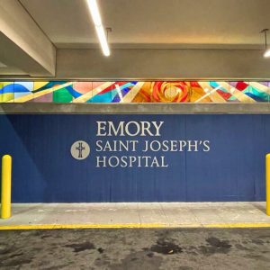
St. Joseph’s Hospital opened its new hospital at a new location in 1978. St. Joseph’s is the oldest hospital in Atlanta, founded in 1880 by the Sisters of Mercy, and was originally located in downtown Atlanta. That facility had become outdated, while patients, doctors, and volunteers relocated to the suburbs. In the early 1970s, they purchased land off of Peachtree-Dunwoody Road.* The new building was dedicated in 1978. The architects were Abreu & Robeson. The majority of Abreu & Robeson’s work was in hospital design, headed by vice president Matt Lawrence Jorgensen. Like other examples of brutalism in DeKalb County, this is not high style but shares characteristics of the style.
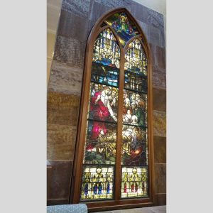
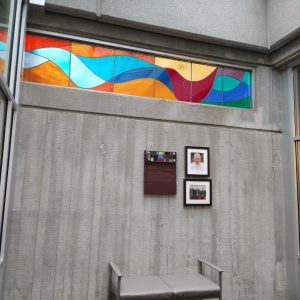
St. Joseph’s is made out of cast concrete walls and blue glass windows. The edges are rounded, softening the appearance slightly. The profile is nevertheless dramatic. One could see the concrete towers as a bastion or fortress of health. The interior features a concrete elevator core, stained glass windows from the original chapel, and chapel with colorful stained glass by artist Stephanie Farrow.
Sister Mary Brian, President of the Facility, commented on the architecture during the dedication. “A hospital design should reflect concern for the patient’s physical, mental and spiritual needs as well as concern for the staff.” The structure features twin patient towers atop a rectangular base. The design allows the nursing staff at the central station to have a direct view in each patient’s room at all times.
*Emory St. Joseph’s Hospital is on the county line of Fulton and DeKalb, with the primary building in Fulton.
Bank of America, 155 Clairemont Avenue (ca. 1982)
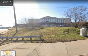
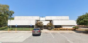
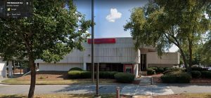
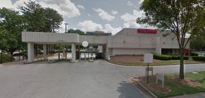
Fulton National Bank built a mid-century modern branch at this location in 1965. It touted three drive-in teller windows. But that was demolished after only 17 years and replaced by this Brutalist style building, which was last occupied by the Bank of America. Somehow this eighties building survived for 38 years, but it was just demolished in 2020. These photos are all from Google Maps timeline.
The bank branch featured two rows of undulating bands of concrete. Arranged at different heights, the bands were cast with a repeating texture. The two levels stepped forward and back and floated over a recessed glass and concrete base.
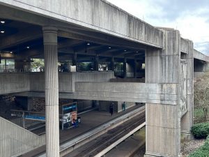
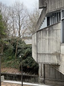
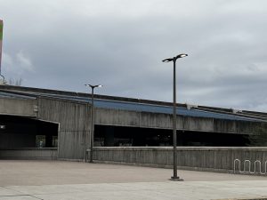
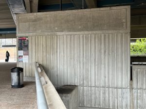
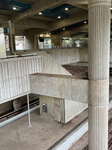
Kensington Marta Station, 3350 Kensington Road (1993)
With this late construction date, should this station even be considered Brutalist? It seems more thought went into Kensington’s design than the other DeKalb Stations, which are of course constructed largely of cement. Edgewood-Candler Park has some concrete elements, but also uses tile. East Lake has a waffle slab ceiling. The Decatur, Avondale, and Brookhaven/Oglethorpe Stations all have some textured concrete, but you’d be hard pressed to find a post 1950s transit/rail station that did not rely on this building material due to the cheap cost. And not all concrete buildings are Brutalist.
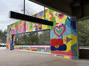
This architect took extra care to cover the entire Marta Station with textured and dimensional concrete; in fact, you get concrete three ways! Many of the cast panels have a smooth surface texture but an alternating projecting and recessed rhythmic design. There are also parts of the station that are entirely smooth. The remainder of the design features concrete that was poured into corrugated molds and then mechanically chipped. But even with all this concrete, the overall structure does not have Brutalist forms. Although, it is a basic transportation shed design, so perhaps it’s one of the most honest structures we found. The station has been altered by a 2019 mural painted by Kevin Bongang and the other stations have also had their plain concrete enlivened by murals.
Notes:
- Also called Nybrutalism, or New Brutalism.
- There are different origin stories for the term Brutalist. https://www.huffpost.com/entry/is-the-washington-metro-brutalist-part-1_b_595a7147e4b0f078efd98bbb
- https://en.wikipedia.org/wiki/Brutalist_architecture#cite_note-32
- https://www.docomomo-us.org/news/atlanta-central-library-nominated-to-the-national-register-of-historic-places
- https://www.atlantadowntown.com/article/peachtree-center-named-historic-district-nominated-for-national-register
- High style generally means designed by a well-known architect, and/or a building with most of the defining features of its architectural style.
- A vernacular building can echo a defined architectural style, but will have far less ornamentation. It can also have elements from several styles and will rarely be associated with an architect.
Additional Resources:
“#SOSBrutalism is a growing database that currently contains over 2,000 Brutalist buildings. But, more importantly, it is a platform for a large campaign to save our beloved concrete monsters.” https://www.sosbrutalism.org/cms/15887473
Fascinated by modern architecture? Docomomo offers more categories and styles for “The Modern Era.” Docomomo US is dedicated to the preservation of modern architecture, landscape and design. https://www.docomomo-us.org/
https://www.instagram.com/cats_of_brutalism/?hl=en
One of many articles with an assortment of modern buildings said to be Brutalist. https://stacker.com/stories/3102/50-arresting-brutalist-structures-united-states
This recent article illustrates how the definition of Brutalist can vary, even in high style designs. https://www.architecturaldigest.com/gallery/most-beautiful-brutalist-buildings-world


